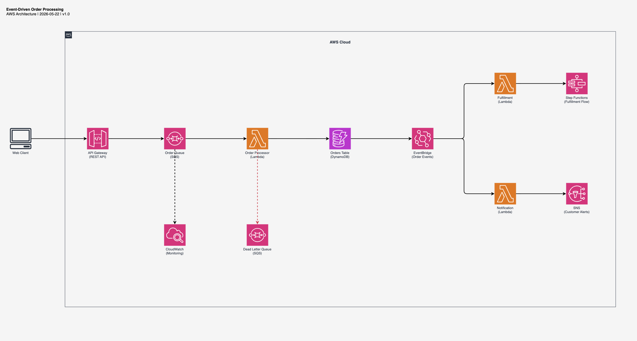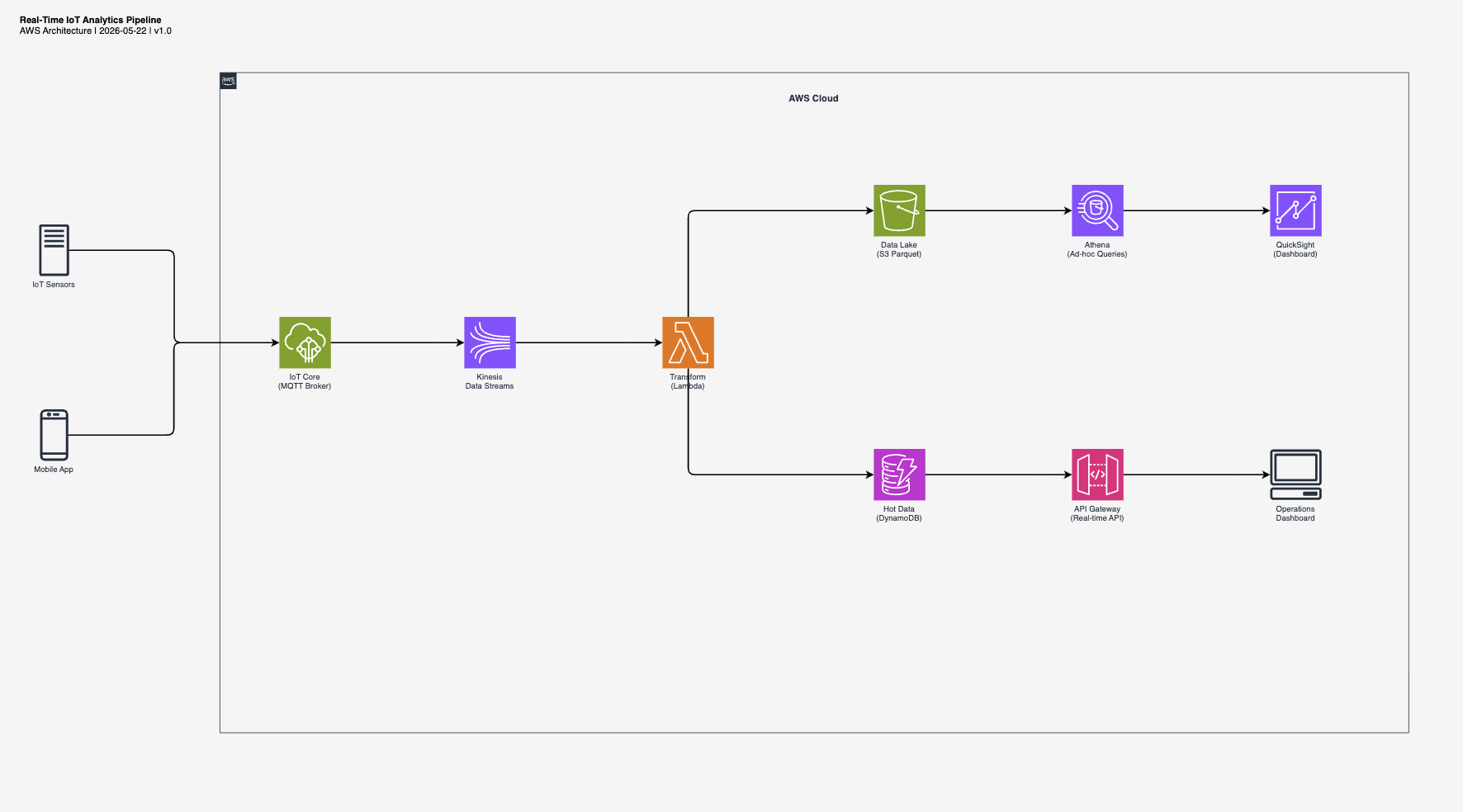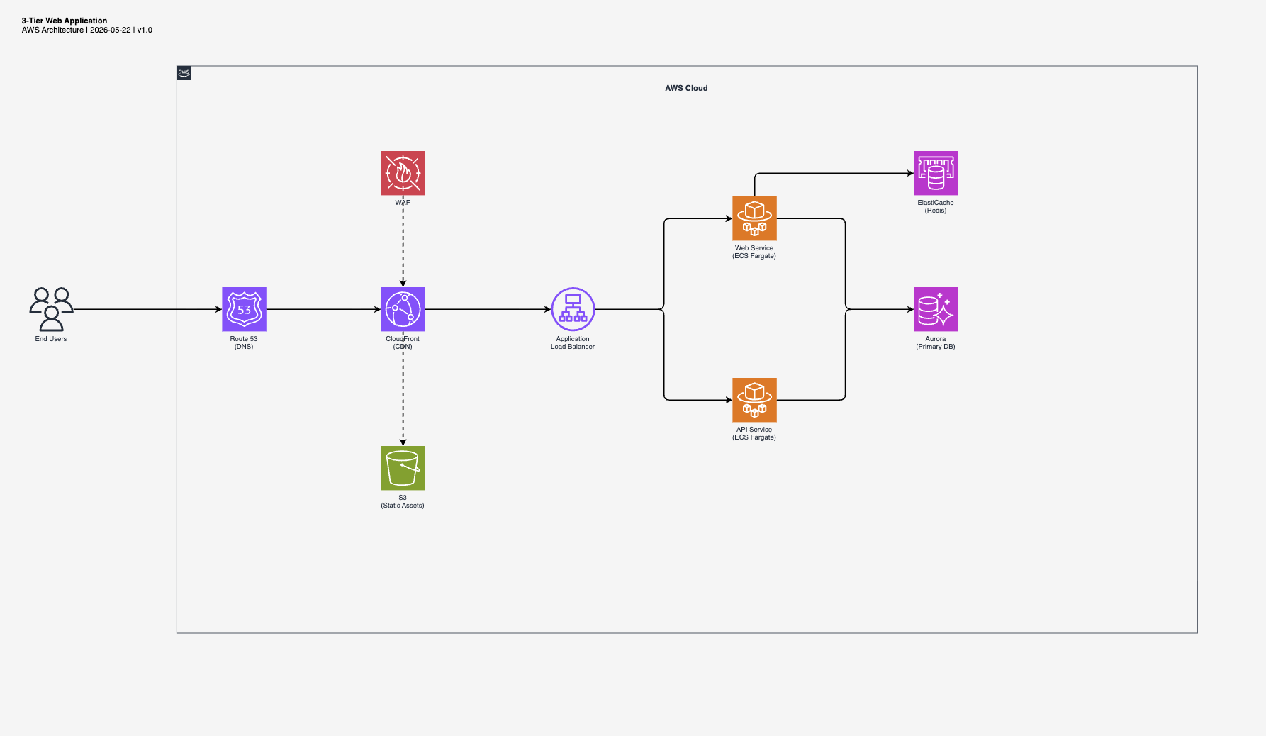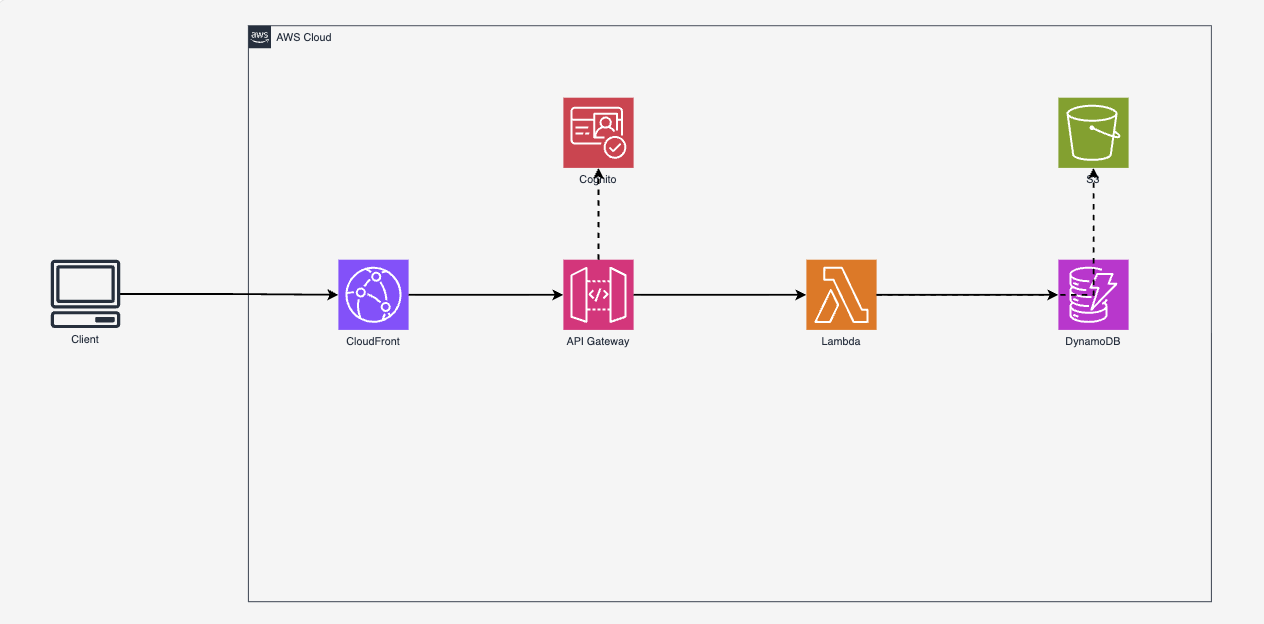
Why I built this
I see architecture diagrams as a craft. A good diagram communicates structure at a glance, guides the eye through the flow, and respects the visual language of the platform it describes. I can spot a generic AI-generated diagram instantly: random placement, wrong colors, broken icons, no visual hierarchy.
But speed matters. When I'm iterating on an architecture, I need a solid draft in seconds, not hours. Something I can open in draw.io, adjust, and hand to a client the same day. The output has to be editable, not a static PNG I'd need to recreate from scratch.
I looked at existing tools. MCP servers that require Python and GraphViz. SaaS products that output non-editable PNGs. Generic diagram generators that don't know the difference between a service icon and a resource icon. None of them matched how I actually work: AWS-focused, draw.io as the editor, specific layout conventions, correct icon styling.
So I built a skill that teaches the AI my rules. Left-to-right flow. Official AWS color palette. Verified icon names extracted from draw.io's source code. The two-pattern rule that nobody documents. The result is a draft that's 80% there, in my style, ready for the 20% of human refinement that makes it good.